A product stuck in 2012
AgencyAnalytics is a reporting and dashboarding platform built for digital marketing agencies. By the time I joined as the first product designer, the interface hadn't meaningfully changed since the product launched in 2012. Meanwhile, the market had evolved significantly.
Leadership wanted a UI refresh — not a full redesign — to maintain continuity for existing users while making the platform competitive again. My challenge was to find high-impact improvements within those constraints.
The constraint became the creative brief
Working within "refresh, not redesign" forced sharper prioritisation — every change had to earn its place by solving a real user pain point.
Finding the friction
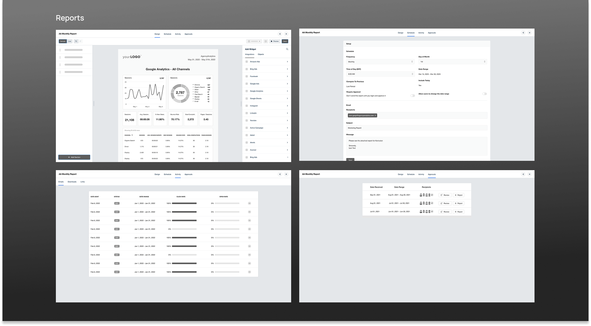
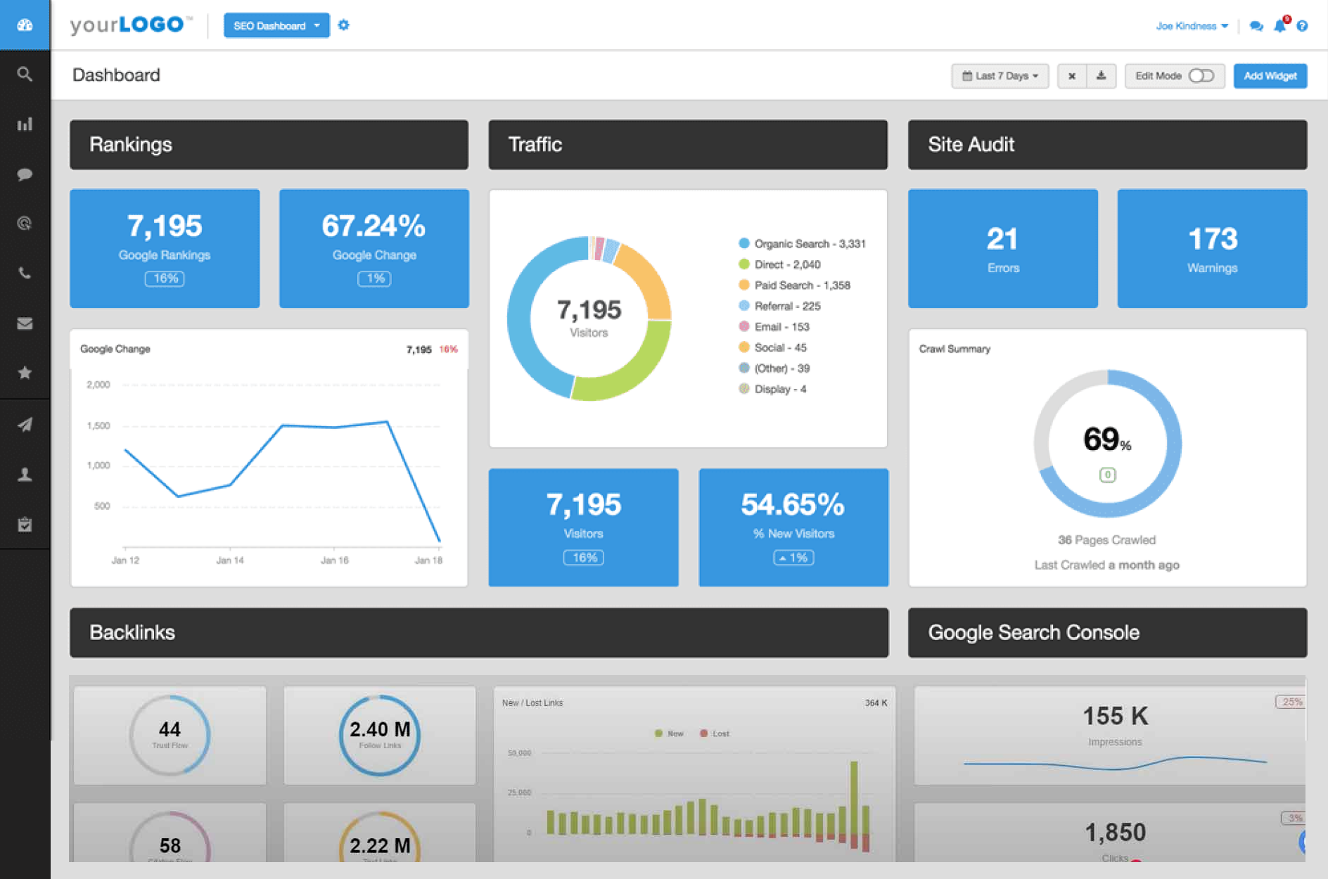
I began with a structured audit of the existing UI, focusing on the four areas with the most user interaction: the navbar, sidebar, reports, and dashboards.
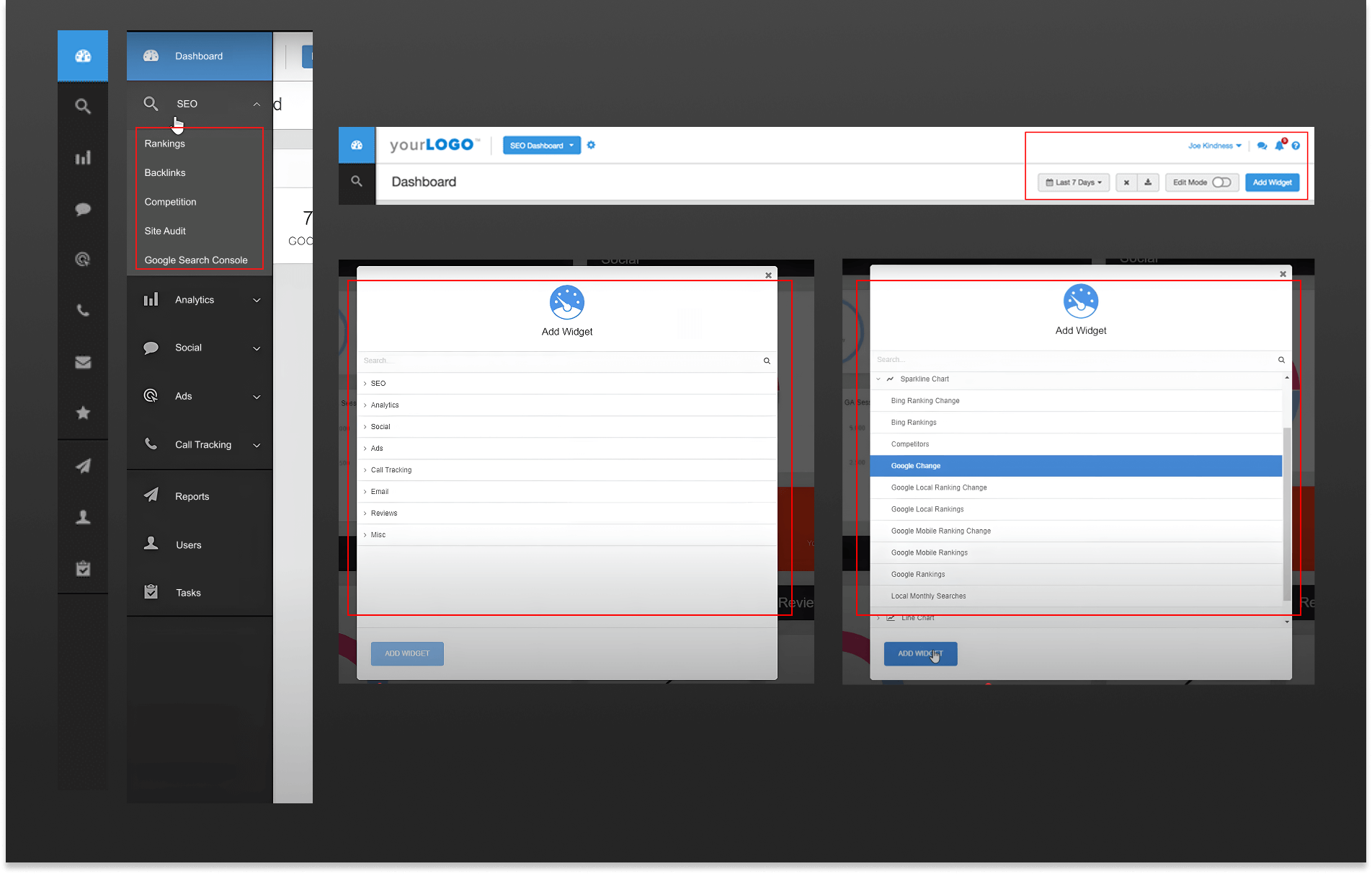
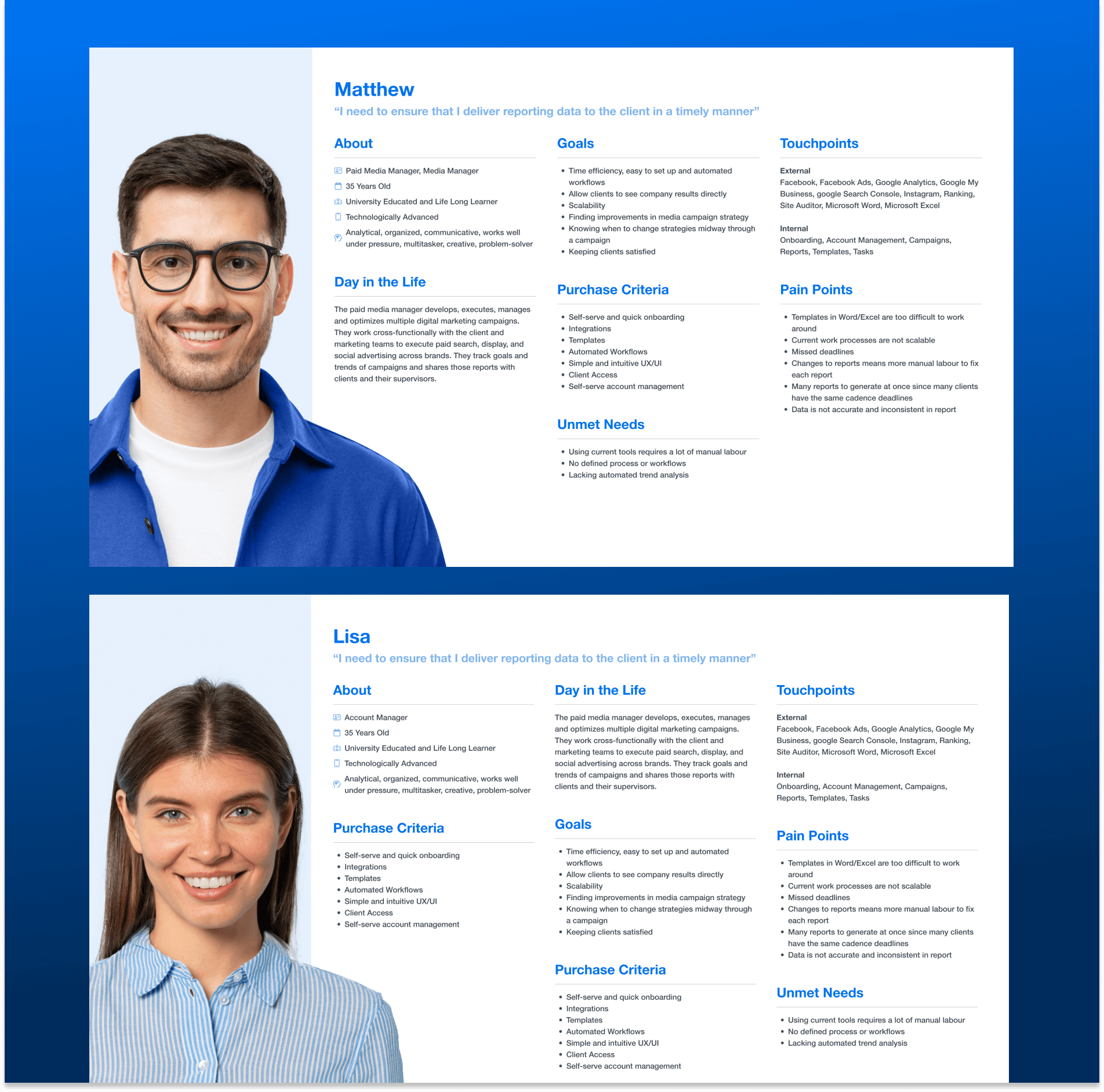
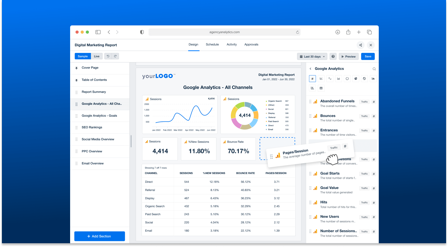
I created user personas to anchor the research and mapped existing flows to quantify pain points. The most telling discovery: the "Add Widget" flow required nearly 7 clicks to complete — a friction point users complained about repeatedly in NPS surveys and G2 reviews.
"The interface is simple and does the job, but it could be aesthetically improved. Some of the secondary reporting elements don't dive deep enough for my preference."
— Jason M., Digital Marketing Specialist (G2 Review)
"Adding widgets is time-consuming and not very smooth. It takes too many clicks."
— Emily R., SEO Analyst (NPS Survey)
"The report builder needs improvement. Right now, it feels more like viewing a report than building one."
— James T., Marketing Manager (NPS Survey)
I also conducted competitive analysis across modern report builders. The pattern was clear: drag-and-drop, inline widget addition, and a lighter visual language had become table stakes.
Designing within real constraints
Refresh vs. Redesign
Leadership preferred evolving existing components rather than introducing new patterns — every decision required stakeholder alignment.
No existing design system
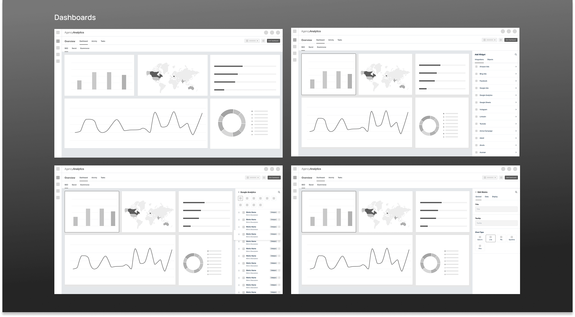
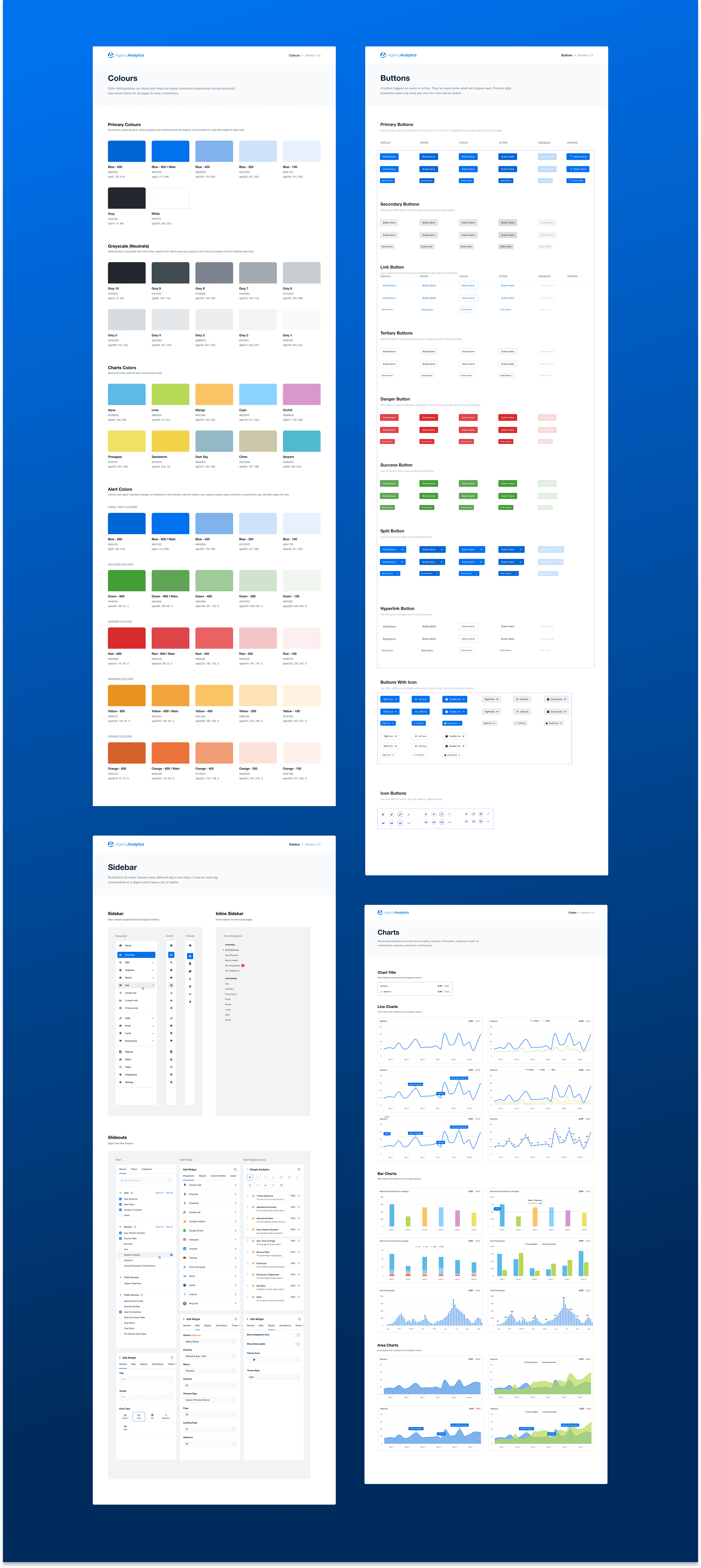
The platform had no documented components or token system. I had to audit, document, and systematize as I redesigned.
Minimising disruption for existing users
Thousands of users had built workflows around the old UI. Changes had to feel evolutionary, not jarring.
Single designer end-to-end
As the sole designer, I owned every artefact — from research synthesis to final specs — while collaborating directly with the CEO.
A structured path from audit to launch
UI Audit & Competitive Analysis
Documented every component, identified outdated patterns, and benchmarked against 6 competitor tools.
User Research & Personas
Synthesised NPS data, G2 reviews, and internal usage data into actionable personas and pain-point maps.
Stakeholder Workshops
Two weeks of collaborative sessions with the CEO and product team to align on scope and priorities.
Wireframes & Concept Reviews
Low-fidelity flows shared in Figma for early feedback before investing in high-fidelity work.
High-Fidelity Design & Prototype
Full visual redesign including a new component library, brand color, and interaction patterns.
Usability Testing & Launch
Moderated sessions with real users before handoff, validating key flows and catching edge cases.
Sketching before committing
With validated research in hand, I began sketching the two flows that needed the deepest structural changes: the Add Widget interaction and the Report Builder experience. Keeping these as rough sketches first allowed fast iteration with stakeholders before any pixel work.

Sketch fast, fail cheap
Sharing rough sketches surfaced stakeholder preferences early — before any investment in high-fidelity work. Three rounds of sketch reviews reduced major revisions in the final prototype significantly.
Structure before style
I built wireframes in Figma and invited stakeholders to annotate directly on the designs. This collaborative approach surfaced edge cases early and built alignment before the high-fidelity phase. Two rounds of revisions led to full stakeholder approval.
Clean, modern, measurably better
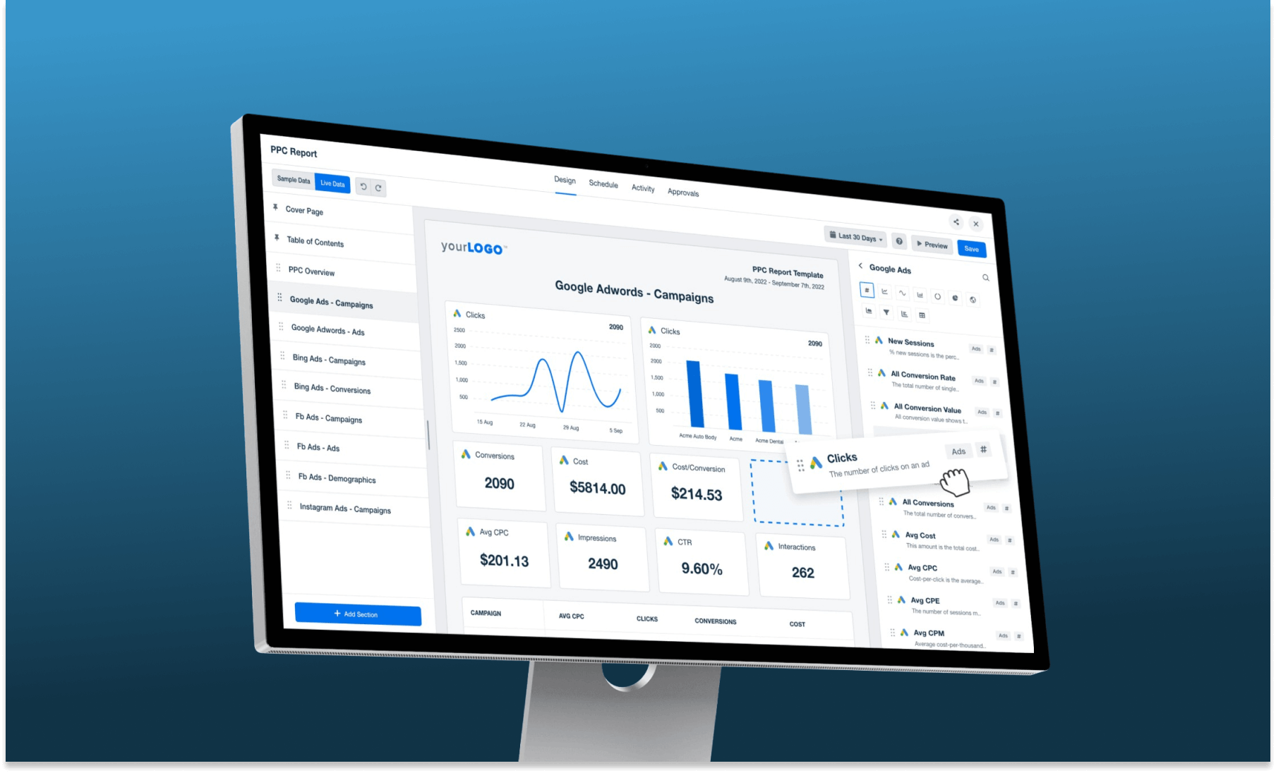
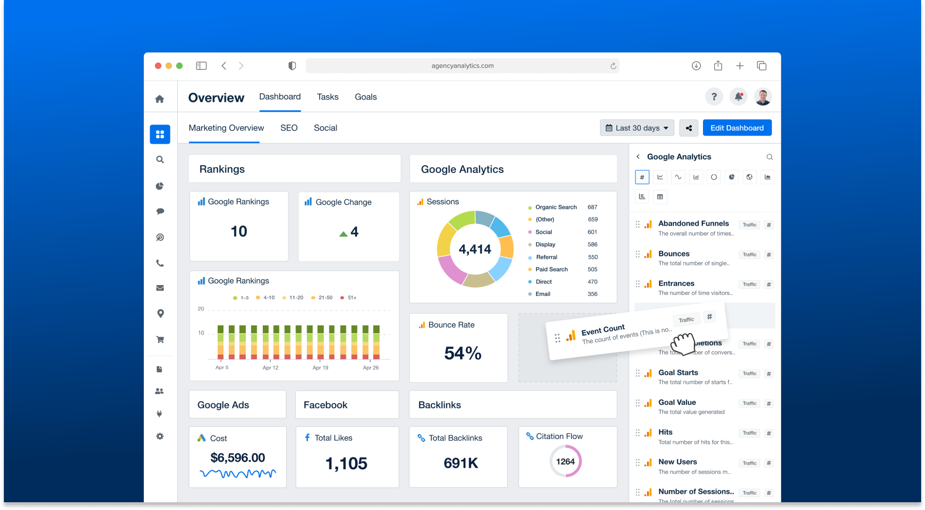
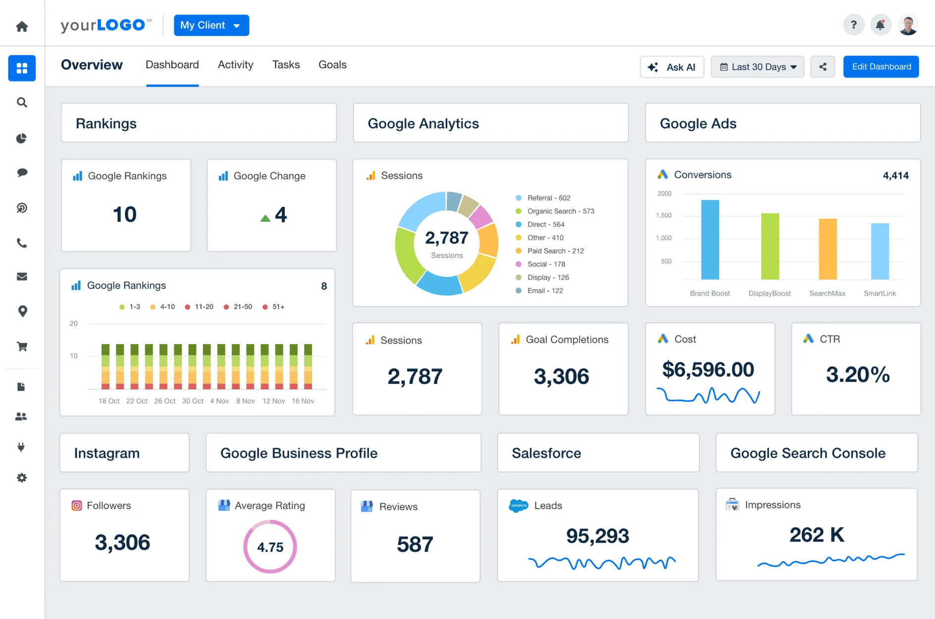
With wireframes approved, I moved to high-fidelity. Key visual decisions included switching from a dark sidebar to a light one for improved readability, introducing a new brand blue (#0072ee), and adding data source icons to widgets for instant recognition.
Before & After
Design that moved the numbers
Post-launch, new customers actively cited the modern UI as a reason for switching from competitors. The platform earned a G2 award in the Easiest to Use category — a direct validation of the design work.
"AgencyAnalytics helps me create quick, automated, and clean reports for our clients which saves me a ton of time. The UI is very clean and easy to understand — you never feel confused."
— Willis W., VP of Marketing
"The reports are clear, customisable, and actually look professional — like something you'd be proud to show off."
— Adam C., Director
Employee of the Month recognition
Received internal recognition for the impact of the redesign at launch — a meaningful signal that design outcomes were visible at the business level.
What I'd carry forward
Constraints sharpen thinking
The "refresh not redesign" constraint forced me to prioritise ruthlessly and find solutions that delivered impact within the existing mental model users had built.
Quantify pain points early
Framing the Add Widget problem as "7 clicks → 2 clicks" created a concrete, shared goal that aligned engineering, product, and design without ambiguity.
Stakeholder buy-in is a design deliverable
Regular sketch reviews and Figma annotation sessions turned stakeholders into collaborators — reducing revision cycles and building momentum.
Design systems pay dividends immediately
Documenting components as I redesigned them meant engineering could start building while I was still finalising later screens — cutting delivery time substantially.