Agencies were building their own tools
AgencyAnalytics helps digital marketing agencies track client performance. But the existing client page didn't give users what they actually needed: a consolidated view of key performance metrics across all clients at once.
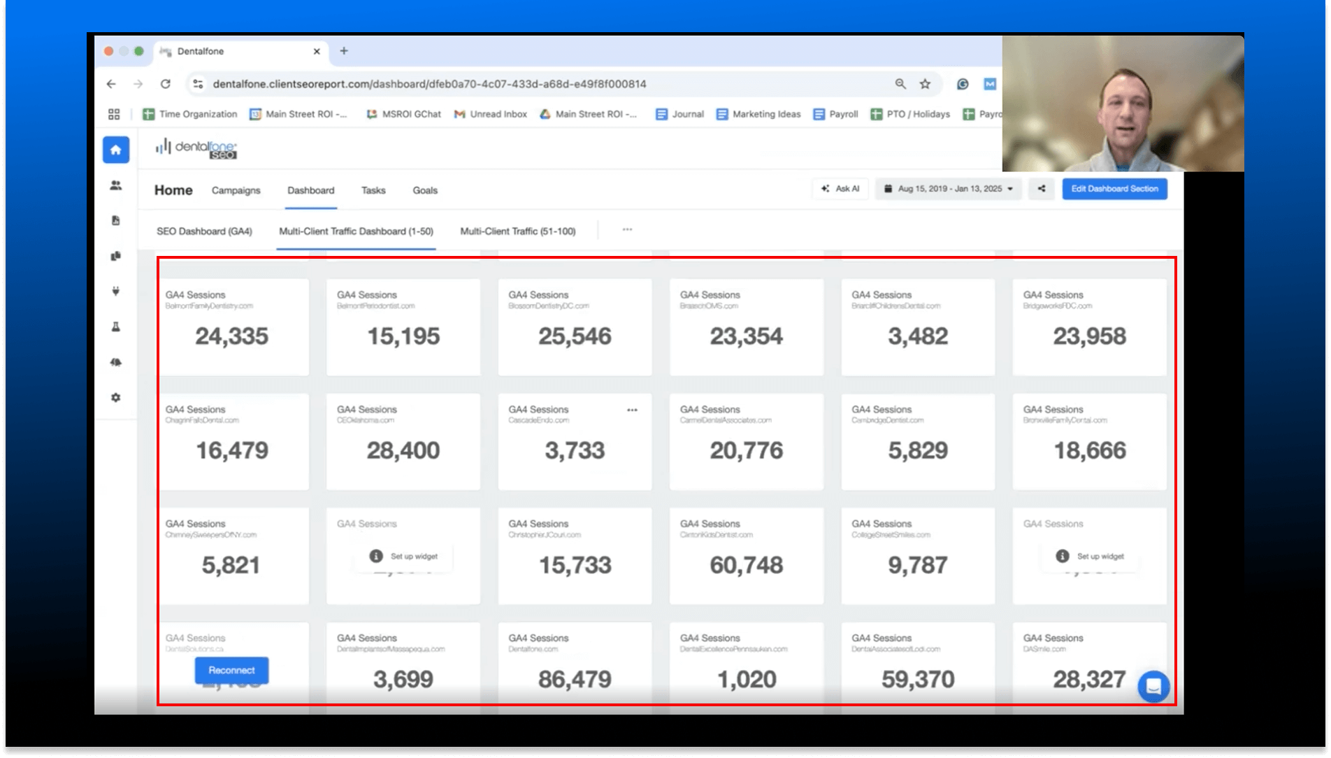
The result? Users were exporting data and manually building performance tables in Google Sheets — spending hours every week doing something the product should have done for them.
When users build workarounds, the product has a gap
The Google Sheets workaround wasn't just inconvenient — it was a signal that a core user job-to-be-done was completely unaddressed in the product.
Hearing it directly from users
I partnered with the Product Manager to review customer feedback and conduct user interviews. The findings were consistent and specific.
Five clear themes emerged from the interviews:
- Users manually built KPI tables in Google Sheets — time-consuming and error-prone.
- Users wanted critical metrics (especially PPC) visible in one table without extra setup.
- Users needed aggregated data at the client level — e.g., total ad spend across all platforms.
- Users wanted to group related clients and see aggregated KPIs per group.
- The existing multi-client dashboard was being repurposed for comparisons it wasn't designed for.
Internal Analytics (Mixpanel)
We supplemented interviews with Mixpanel data on current list view behavior:
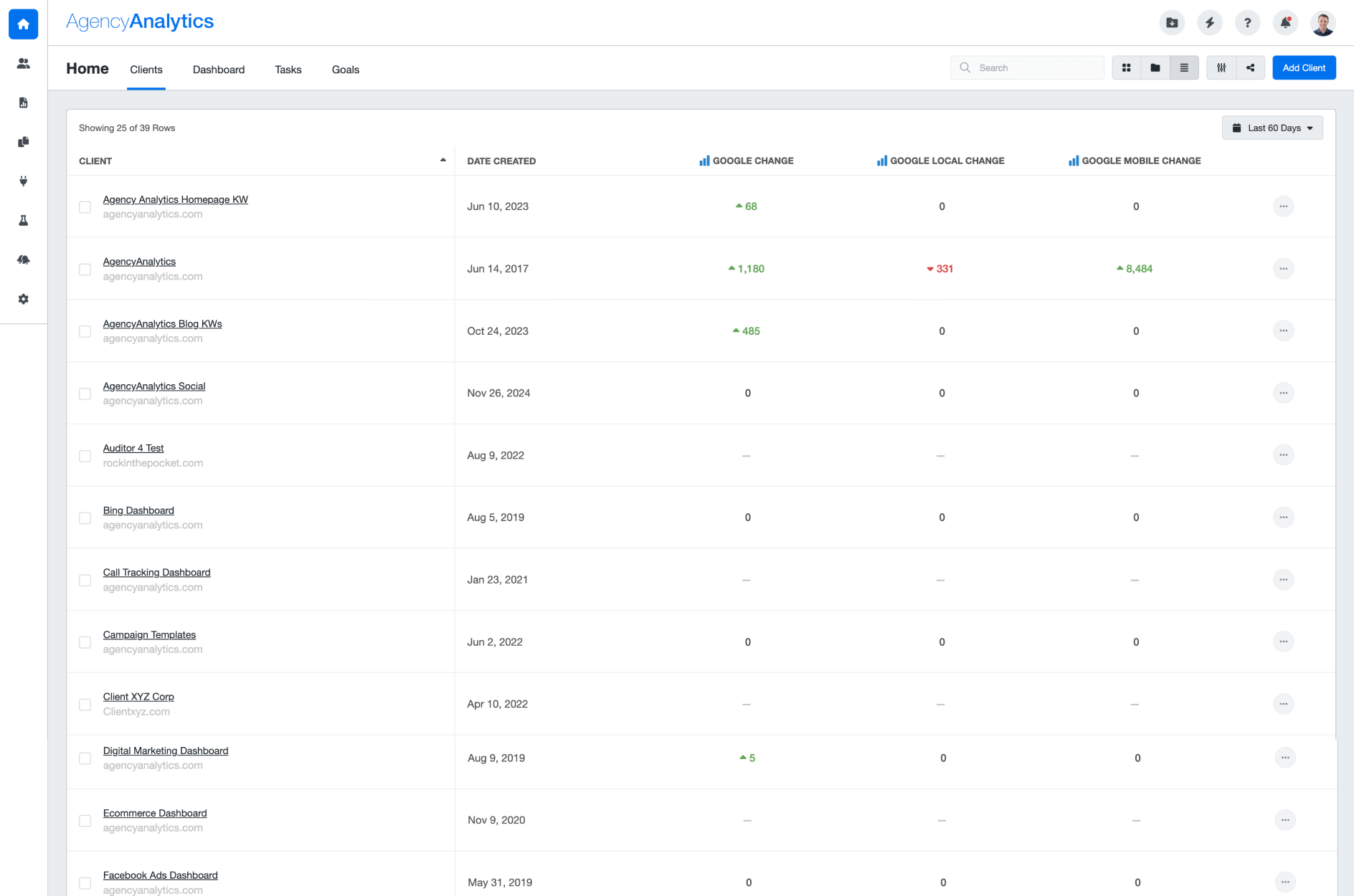
Low list view adoption
Users rarely switched to the list view — the default tile view was used almost exclusively.
Minimal metric customisation
In the existing list view, users rarely added or customised columns — suggesting the experience felt too complex.
Balancing user needs with business objectives
Data complexity at scale
Agencies manage dozens of clients across multiple ad platforms — displaying aggregated metrics without overwhelming users required careful information hierarchy design.
Monetisation without frustration
Advanced KPIs needed to be paywalled for free plan users — but the paywall experience had to feel helpful, not punishing.
Migration from the tile view
Making the table the default required convincing existing users of the value switch — through design, not just a settings change.
Fast delivery cycle
The project had a tight 1-month timeline from research through handoff — requiring sharp scope decisions and parallel workstreams.
Four clear targets
After weeks of synthesis with customers and the product team, we aligned on four concrete outcomes:
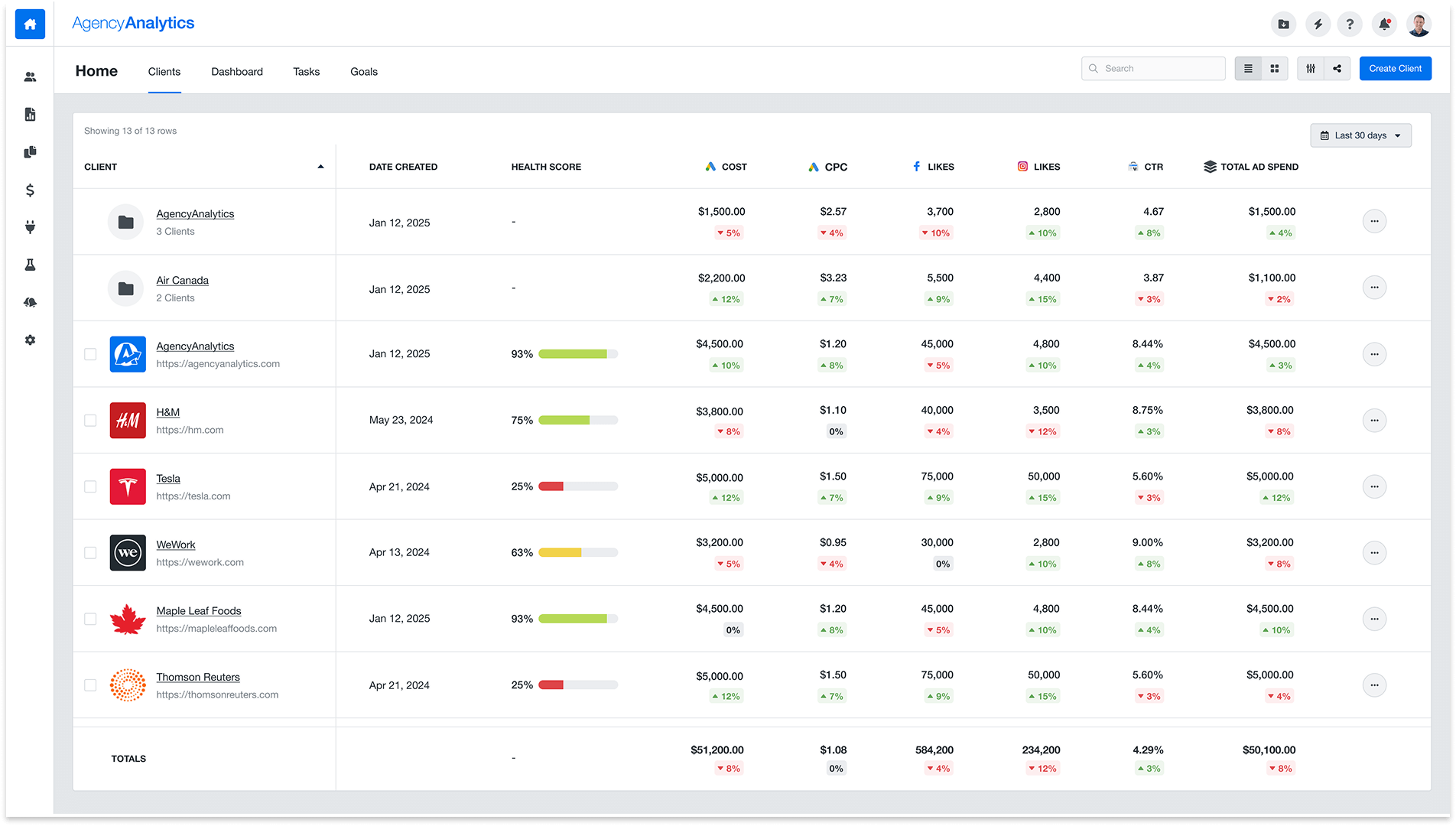
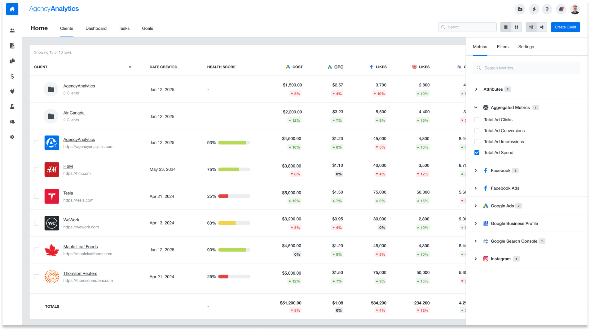
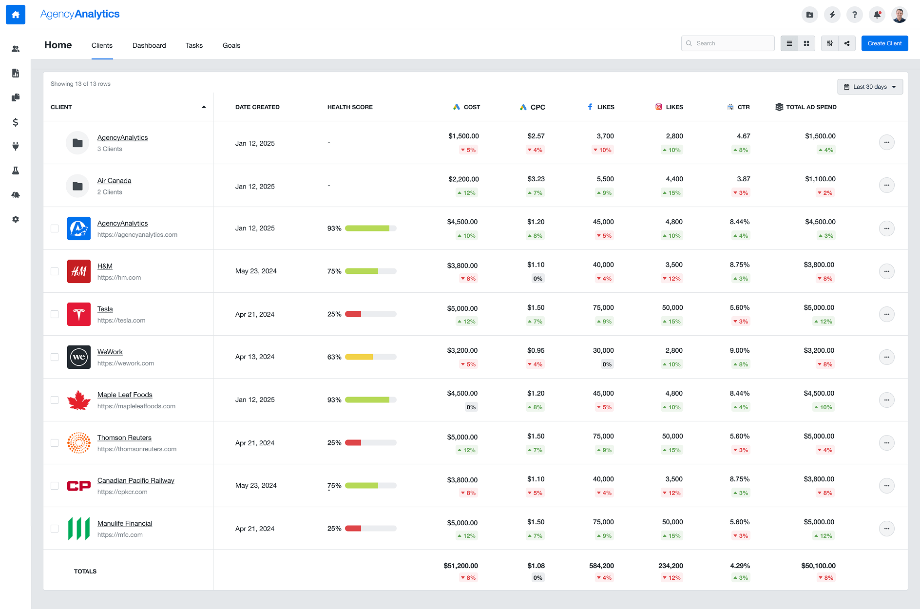
Default to the list view
Show the KPI table by default — surfacing the most important metrics without users having to change settings.
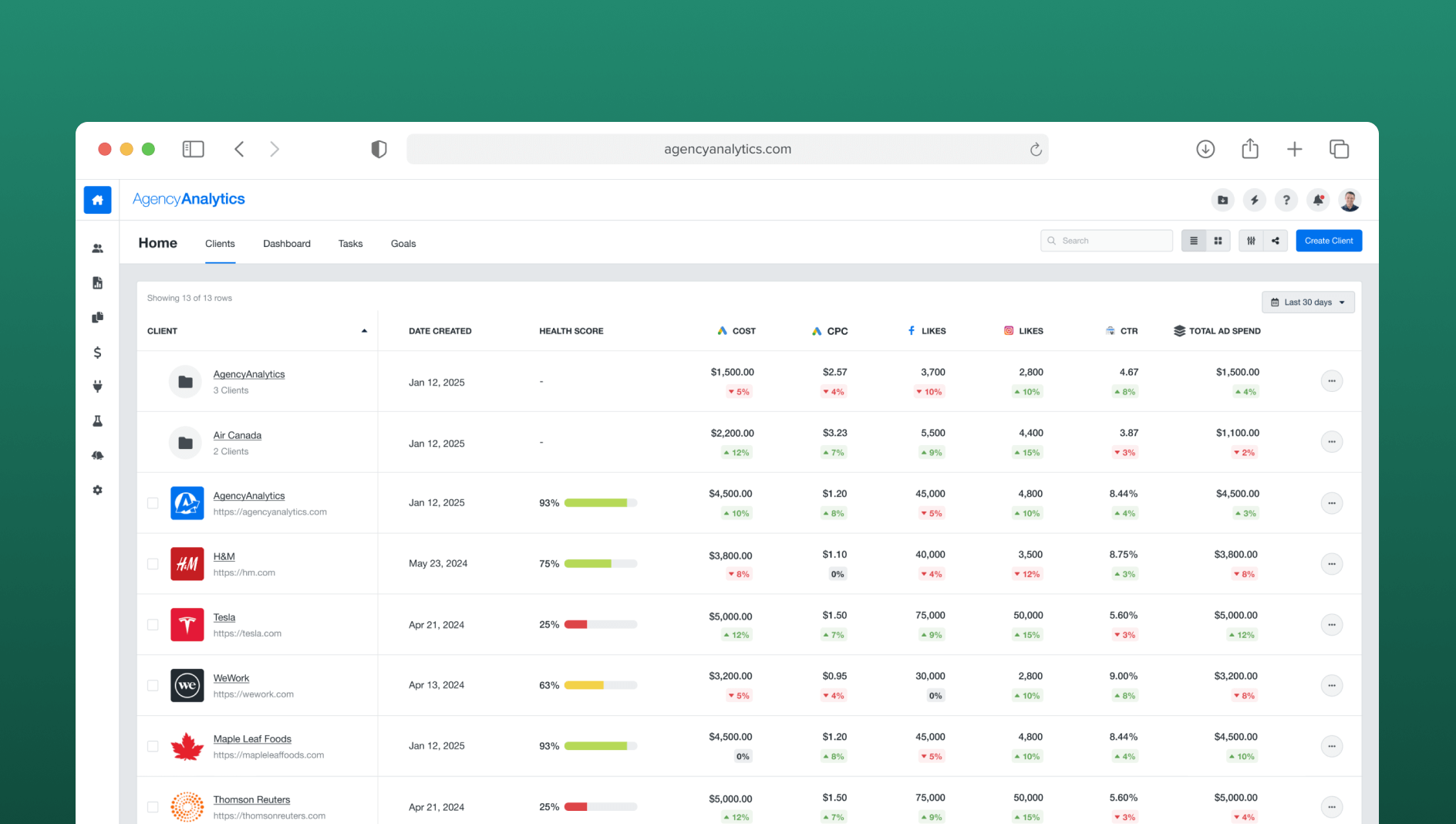
Add a Totals row
Sum each metric across all clients so users can see aggregate performance instantly — eliminating the spreadsheet.
Pre-built PPC metrics
Include the most-requested metrics out of the box: Total Ad Spend, Clicks, Impressions, and Conversions.
Paywall advanced metrics
Gate premium KPIs for freelancer plan users — driving upgrades to Agency and Enterprise plans.
From synthesis to shipped
Customer Interviews + Mixpanel Analysis
Combined qual and quant to validate the problem and understand the full scope of the spreadsheet workaround.
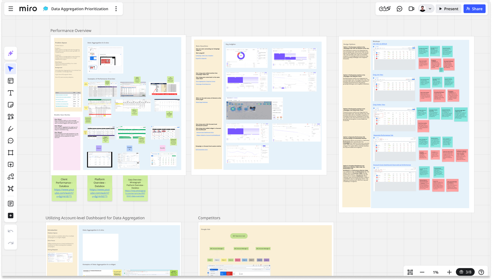
Workshop & Goal Alignment
Collaborative Miro sessions with PM, engineering, and stakeholders to define scope and agree on success metrics.
Concept Exploration in Figma
Explored 3 table layout approaches before aligning on the clearest information hierarchy.
High-Fidelity Design
Designed the full table interaction including the Metric Explorer, Total row, grouping, and paywall states.
Moderated Usability Testing
Recruited real customers to validate the design before handoff — with task completion as the primary signal.
Everything a user needs, in one table
The new Clients page puts key performance metrics front and centre. Users can immediately see ad spend, clicks, and conversions across all clients — no setup, no exports.
Before & After
Validated with real customers
Before launch, we ran moderated usability sessions with three real customers. Tasks included adding a metric, navigating the table, and interpreting the Totals row. All participants completed every task successfully — and the feedback was telling:
"Having a total row saves me a lot of time. I don't have to export to a spreadsheet anymore."
— Aaron Bunner, Digital Marketing Manager
"The list view makes way more sense for performance tracking. I'm glad it's the default now."
— Bjorn Engels, Senior Analyst
"It's really helpful to see ad spend, clicks, and conversions directly without extra setup."
— Lucas Hernandez, Paid Media Manager
100% task completion rate
All participants completed every assigned task in the usability sessions — a strong validation signal before launch.
Time saved, conversions gained
The feature also had an unexpected downstream effect: several users who had previously churned from the platform specifically cited the new KPI table as a reason to return. The product was now doing something they'd been doing manually — and doing it better.
Design as a growth lever
The paywall design drove real plan upgrades — demonstrating that thoughtful feature gating, when built around genuine user value, converts without feeling punitive.
Principles I'd apply again
Follow the workaround
When users build their own solution outside the product, that's the clearest possible signal that a feature is missing. The Google Sheets table was the brief.
Qual + quant tells the full story
Interviews gave us the "why" — Mixpanel data gave us the "how often." Neither alone would have been sufficient to prioritise and scope the work.
Paywalls are a UX problem too
The paywall design needed to feel like a natural invitation to upgrade — not a gate. Getting that tone right required iteration and usability testing.
Default states carry enormous weight
Switching to the table as default — rather than making it a toggle — was the single highest-leverage design decision in the project. Most users never change defaults.